Theming
The Theming tab lets you customize the look and feel of the chat widget with a live preview that updates in real time.
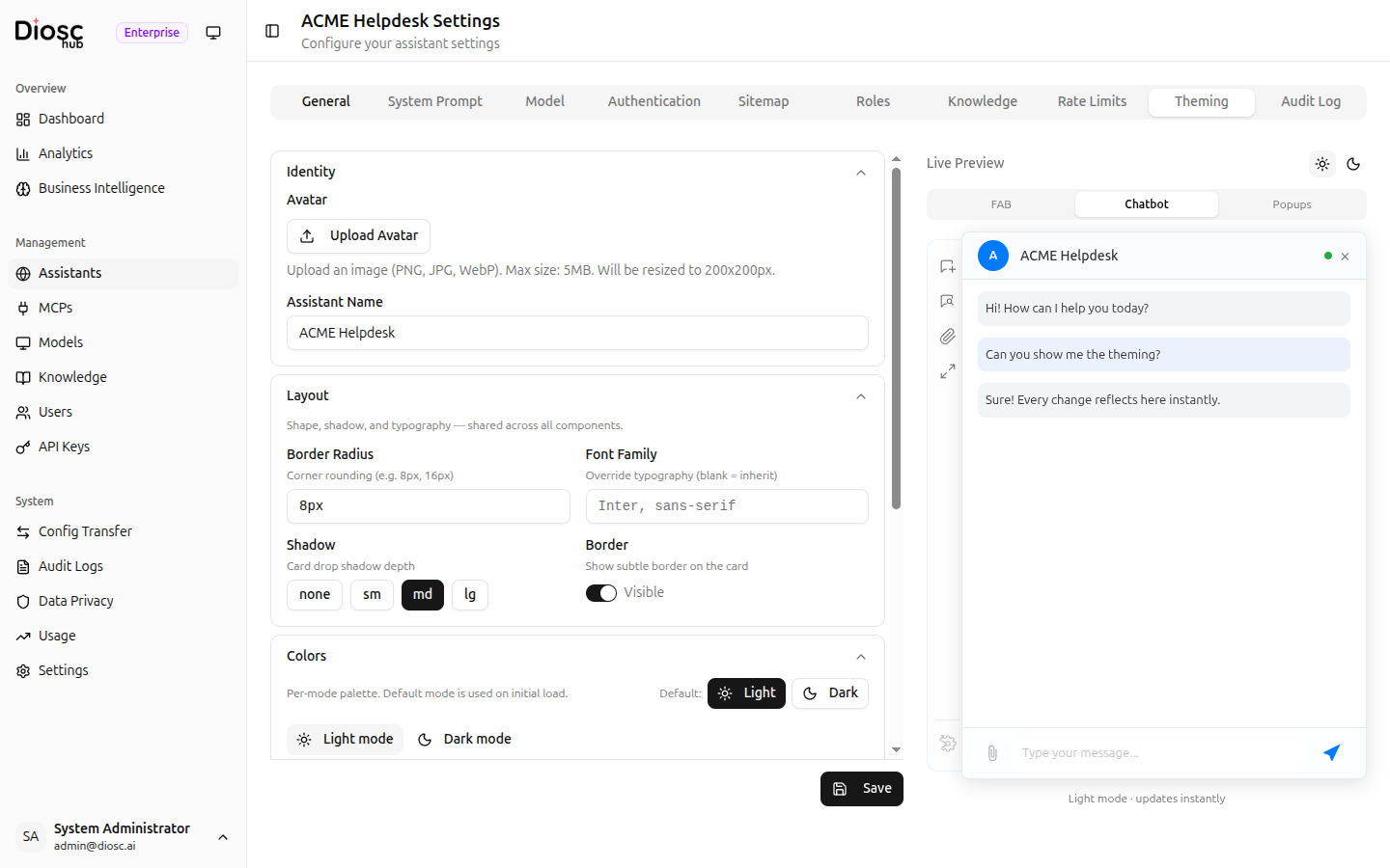
Identity
Configure the visual identity of the assistant shown in the chat header.
| Setting | Description |
|---|---|
| Avatar | Upload a custom avatar image (PNG, JPG, WebP, max 5 MB, resized to 200x200px) |
| Assistant Name | Display name shown in the chat header |
Layout
Control the shape and typography shared across all chat components.
| Setting | Description |
|---|---|
| Border Radius | Corner rounding for the chat card (e.g., 8px, 16px) |
| Font Family | Override the default typography (leave blank to inherit from the host page) |
| Shadow | Card drop shadow depth: none, sm, md, or lg |
| Border | Toggle to show or hide a subtle border on the chat card |
Colors
Define color palettes for light and dark modes.
- Select a Default mode (Light or Dark) that is used on initial load
- Switch between the Light mode and Dark mode sub-tabs to configure each palette independently
- Adjust individual color values for backgrounds, text, accents, and other UI elements
Live Preview
The right-hand panel shows a real-time preview of the chat widget as you make changes. Use the three preview tabs to see different widget states:
| Preview Tab | Shows |
|---|---|
| FAB | The floating action button (collapsed widget) |
| Chatbot | The full chat window with messages |
| Popups | Notification and popup styles |
Toggle between light and dark mode previews using the sun/moon icons in the top-right corner of the preview panel.
Every change you make on the left is reflected instantly in the preview on the right, so you can fine-tune the appearance before saving.
Saving
Click Save at the bottom of the settings panel to apply your theming changes. The new theme takes effect immediately for all users of this assistant.
Next Steps
- Rate Limits -- Review usage limits for this assistant
- General & Authentication -- Update the assistant name and avatar